Meadowbrook Dream Transformation Kitchen and Bathroom Remodel
Our clients from Meadowbrook decided it was time to revamp their forever home, kicking off a kitchen and double bathroom remodel. The first goal of this renovation project was to expand the kitchen and create an open-concept footprint that seamlessly connected it with the living room and dining area. The original layout felt cramped and disconnected, making it challenging for the homeowners to entertain or enjoy family time. Just down the hall, the guest bathroom had an awkward layout, with a washer and dryer crammed into a tight closet, causing congestion and disrupting the flow. Upstairs, the primary bathroom suffered from a lack of natural light, feeling dark and cramped. Our goal was to make the space feel brighter and roomier while addressing issues with the shower size and layout.
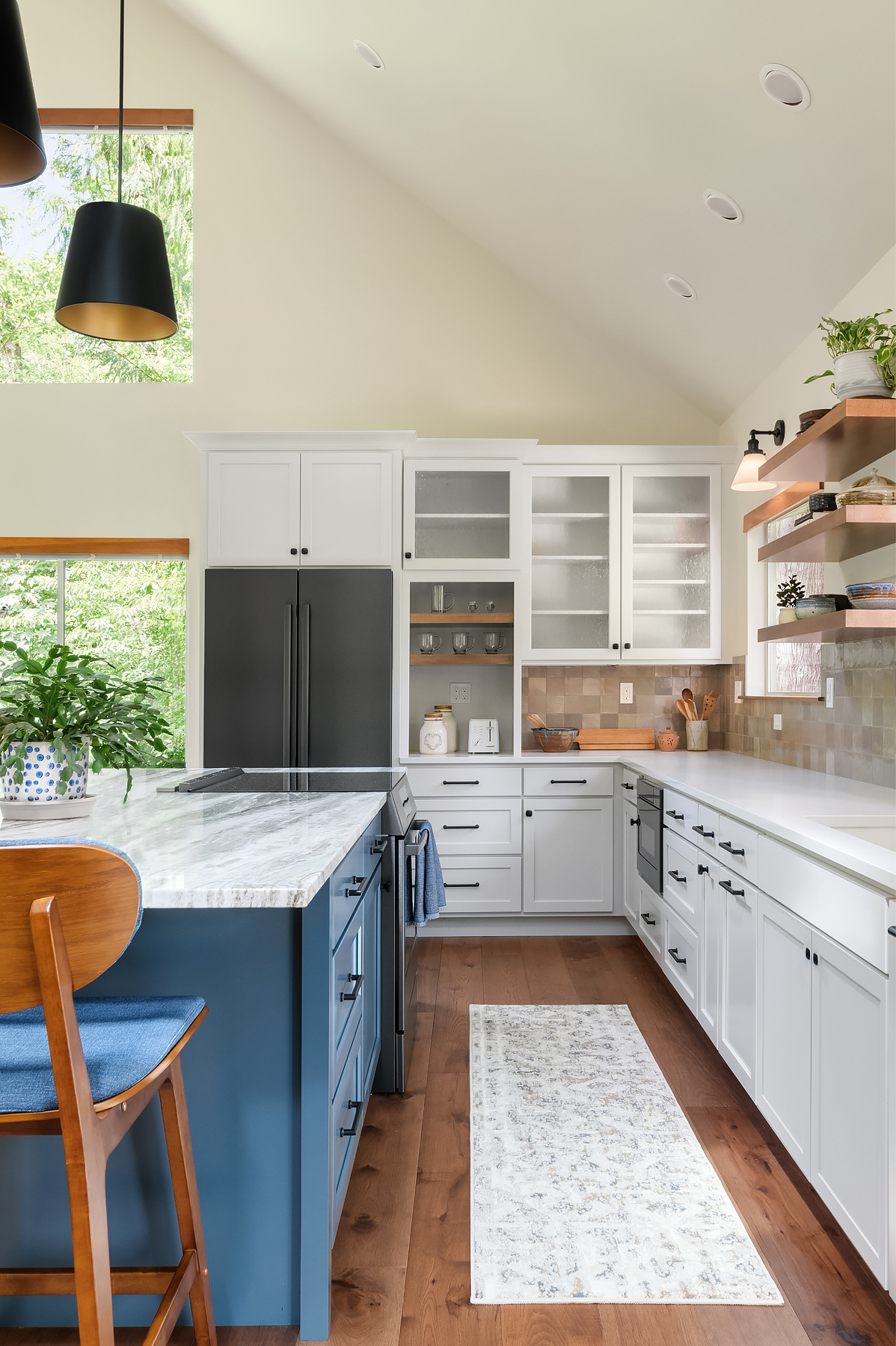
Some of the more specific points in the kitchen included the cathedral ceilings, which made some rooms feel cavernous, creating lighting, heating, and noise reduction challenges. A large fireplace took up valuable space in the dining area and disrupted the flow to the hallway. The clients found it to be more of an eyesore than a functional feature. They also wanted to maintain easy access to their backyard but moved the access point out of the kitchen, which needed to be better placed. To address these concerns, the walls surrounding the kitchen were removed, extending into the neighboring office space to create an open-concept room.
In harmony with the pendants' black outer shades and matte black cabinet hardware, sleek black stainless-steel appliances add a touch of sophistication. Dark wood accents on the floating shelves and new hardwood floors complement these cooler tones, infusing visual interest into what was once a monochromatic space.
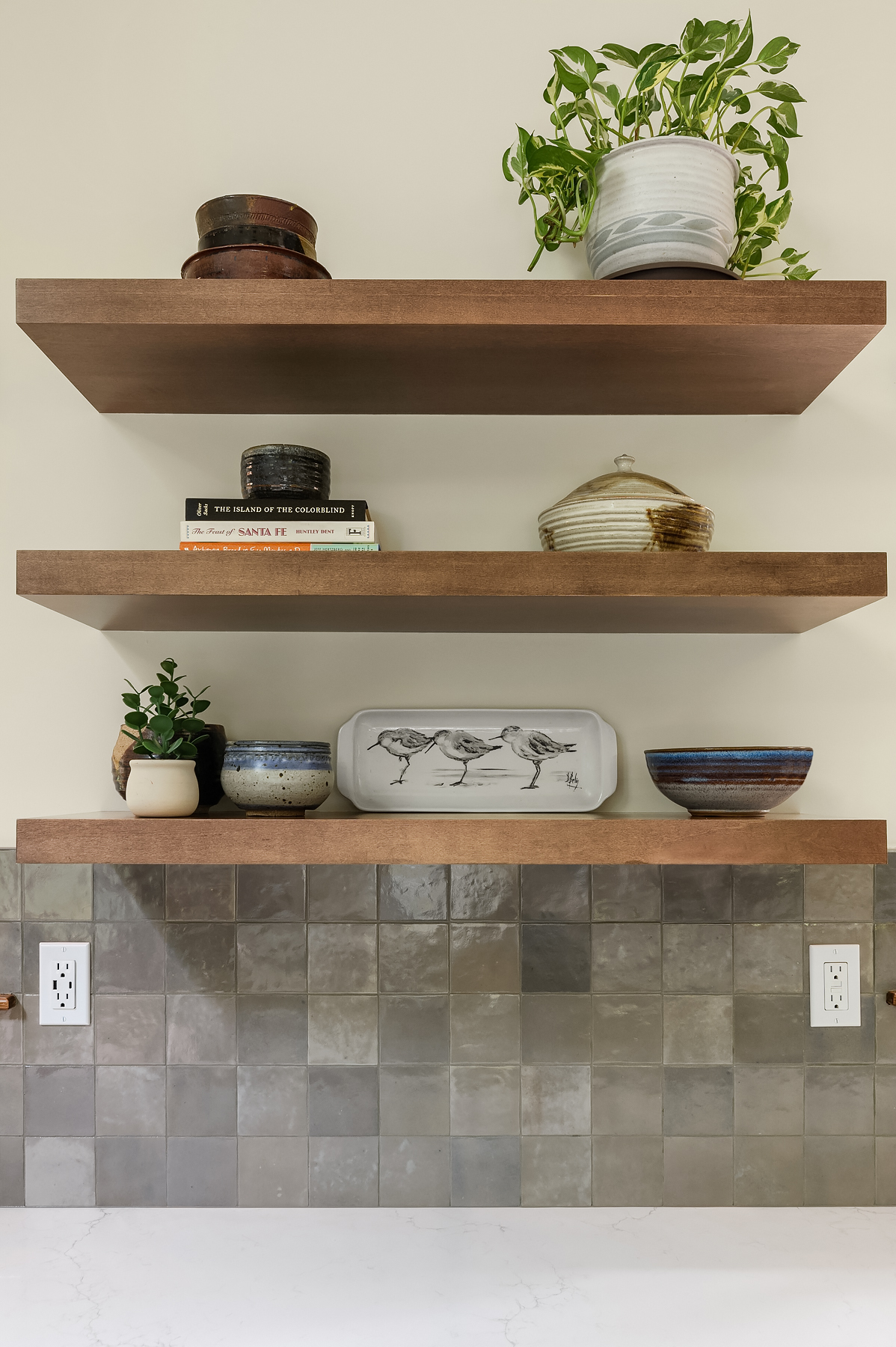
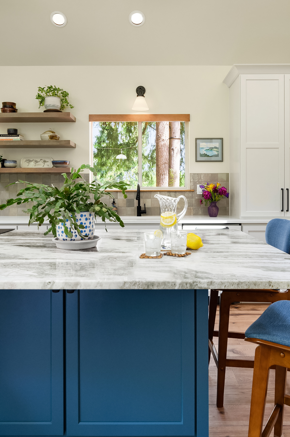
The Zellige glossy backsplash tile, in a versatile greige hue, features a naturally varying pattern that captivates the eye, inviting further exploration. To address the soaring cathedral ceilings, we installed towering 3-light pendants with captivating brass inner shades above the kitchen island. These pendants fill the space perfectly and are one of the clients’ favorite additions to the kitchen.
Misterio quartz boasts a subtle gray veining set against a white backdrop, harmonizing beautifully with the quartzite island adorned with red garnet and swirling brown, amber, and grey tones. Embracing a classic transitional approach, we combined white cabinets with a touch of blue beneath the quartzite, introducing a much-needed cool tone to the craftsman-style space.
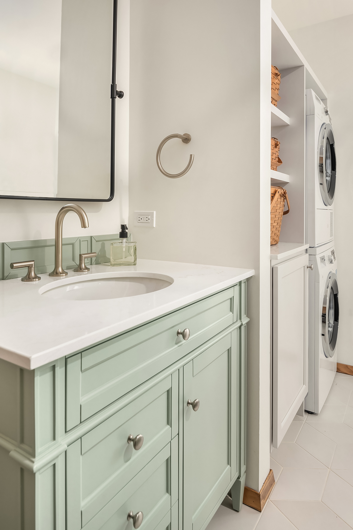
The guest bathroom was plagued with tight turns, odd soffits, and bump-outs on walls that made the space feel messy and cramped. Because the bathroom was butted against the fireplace, removing the chimney created ample room for a broom closet and the relocated shower. It also gave us the freedom to move the laundry to the far corner in front of the toilet to provide more elbow room and improve the bathroom's functionality. A sliding glass door with a built-in towel bar was added to the shower to optimize limited wall space, and a shower niche was included for storage convenience.
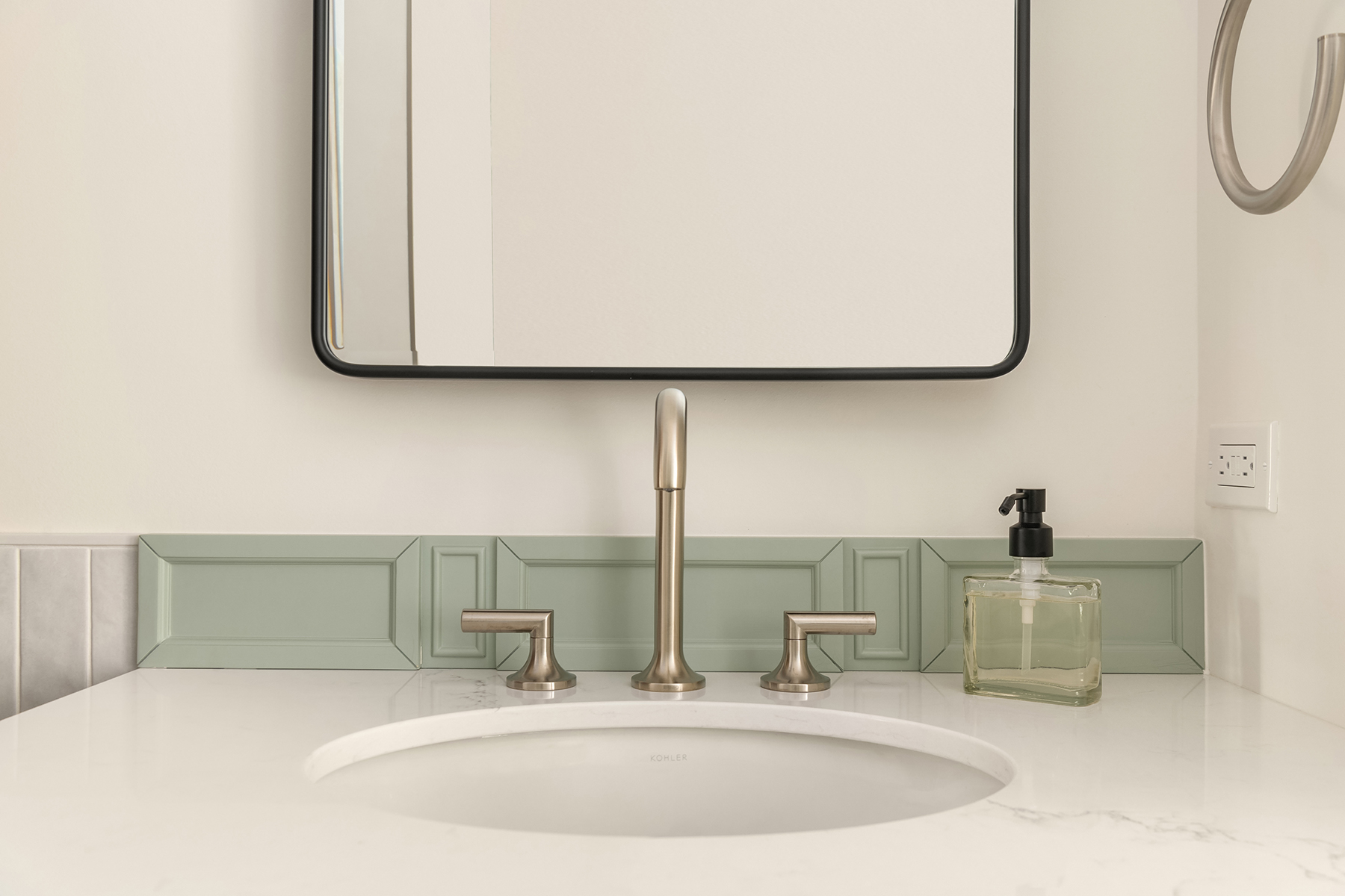
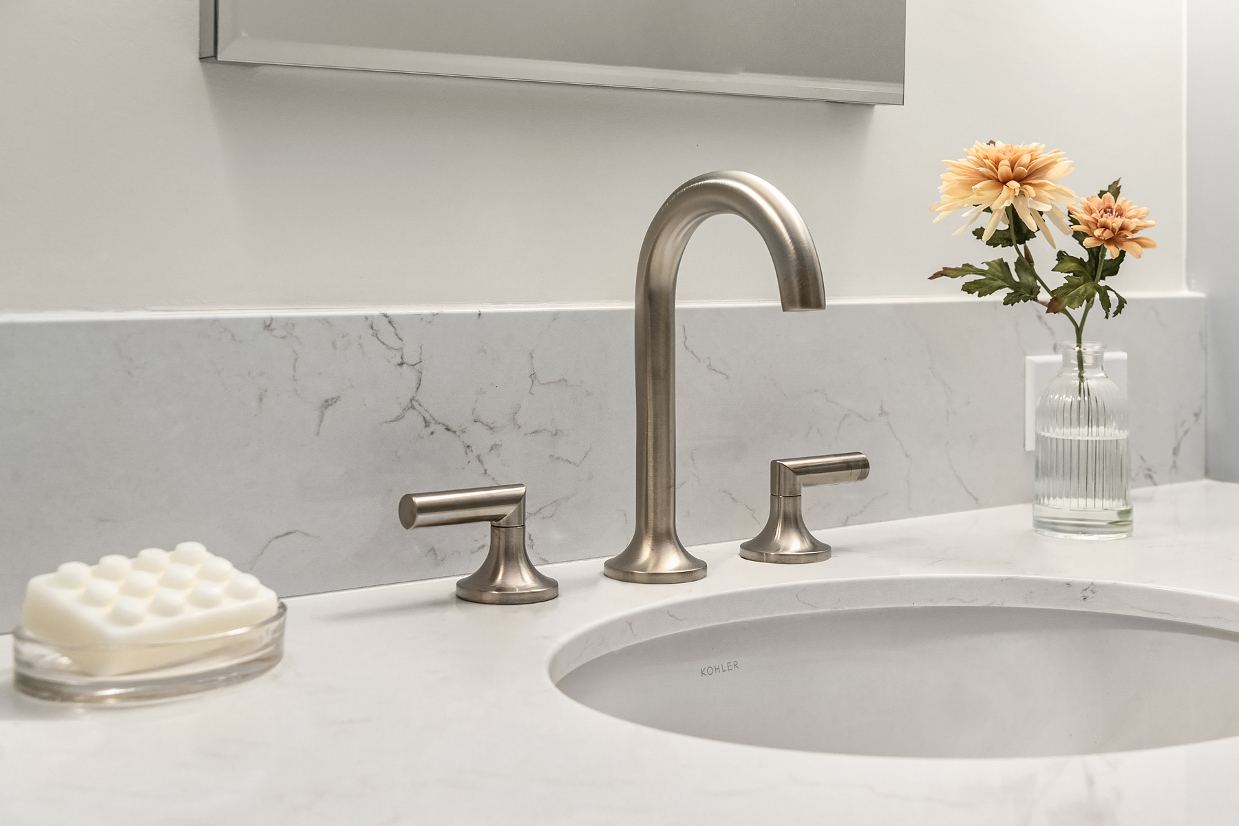
An elegant touch is added with the pale sage green vanity, featuring subtle ornamentation that complements the sleek, unadorned satin nickel hardware. Our clients appreciated the interplay of organic and geometric shapes, exemplified by the pivot mirror above the vanity. These updates infuse a sense of fun and freshness into the space, making it more inviting for guests.
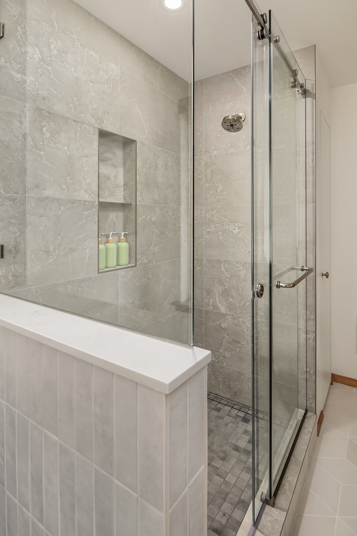
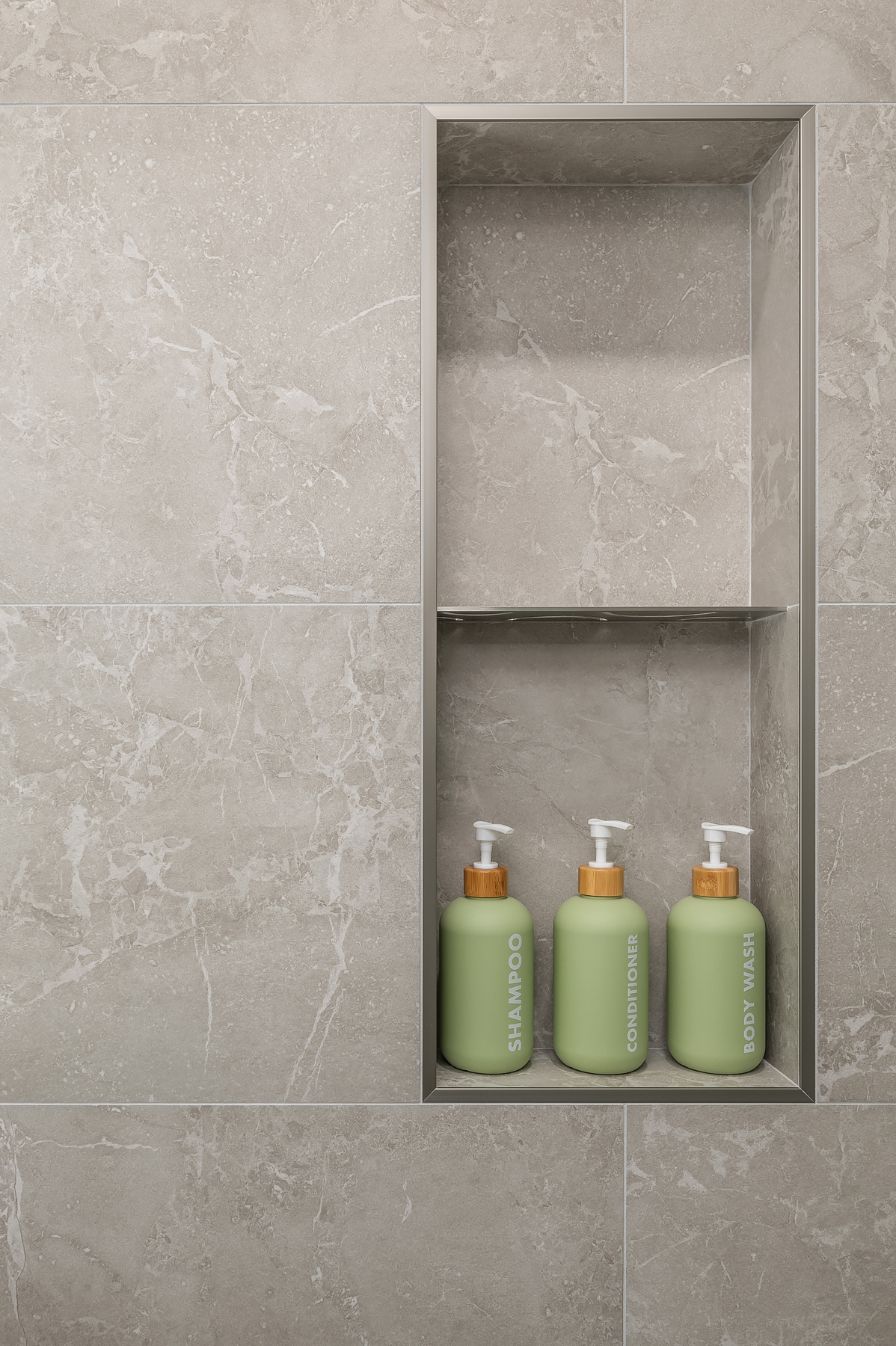
We drew inspiration from the rugged terrain surrounding the home, incorporating stone-like tiles on the shower floor. Continuing upward on the shower walls, we used a natural-looking tile with bold fractures and varied patterns. The space achieves a seamless transitional style, blending contrasting colors and combining modern and traditional elements effortlessly.
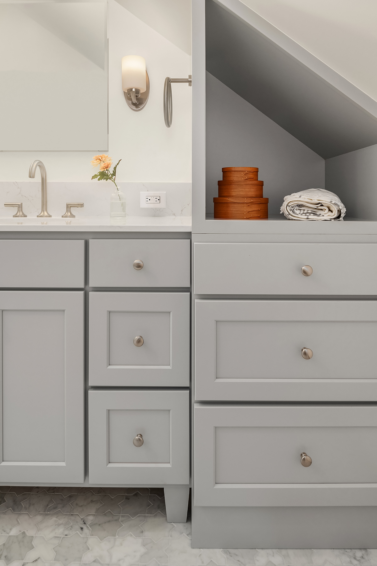
In our pursuit of creating a bathroom designed for long-term use, we made the decision to eliminate the tub and forego a shower curb, enhancing accessibility and elevating the overall sense of luxury. Moreover, we reimagined the vanity by incorporating additional storage into the end cap, adapting it to the ceiling's slope. As this bathroom is just a short stroll down the hall from the primary bedroom, it was imperative to ensure that the space exuded a sense of spaciousness and cleanliness, making the journey to it well worth it.
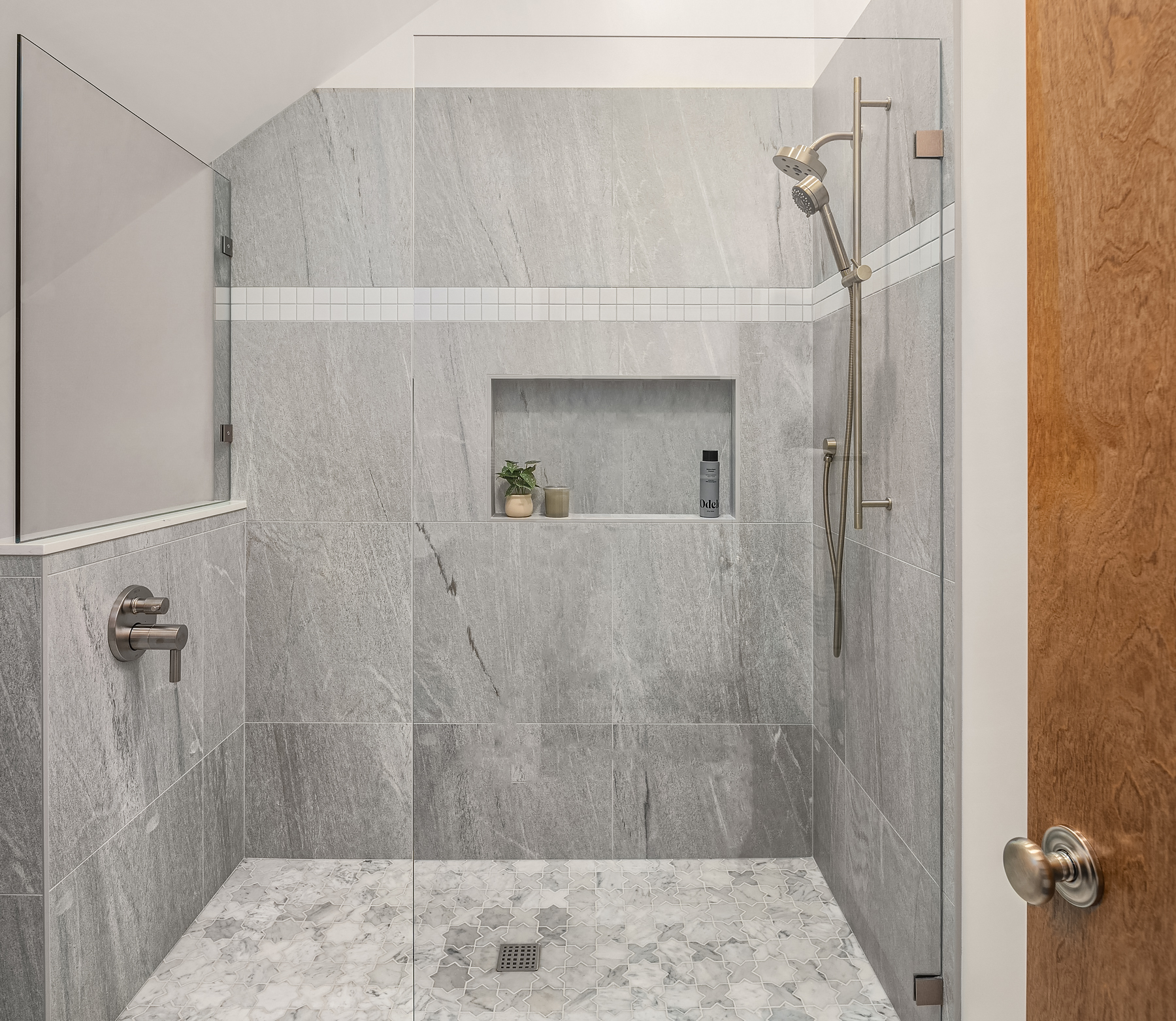
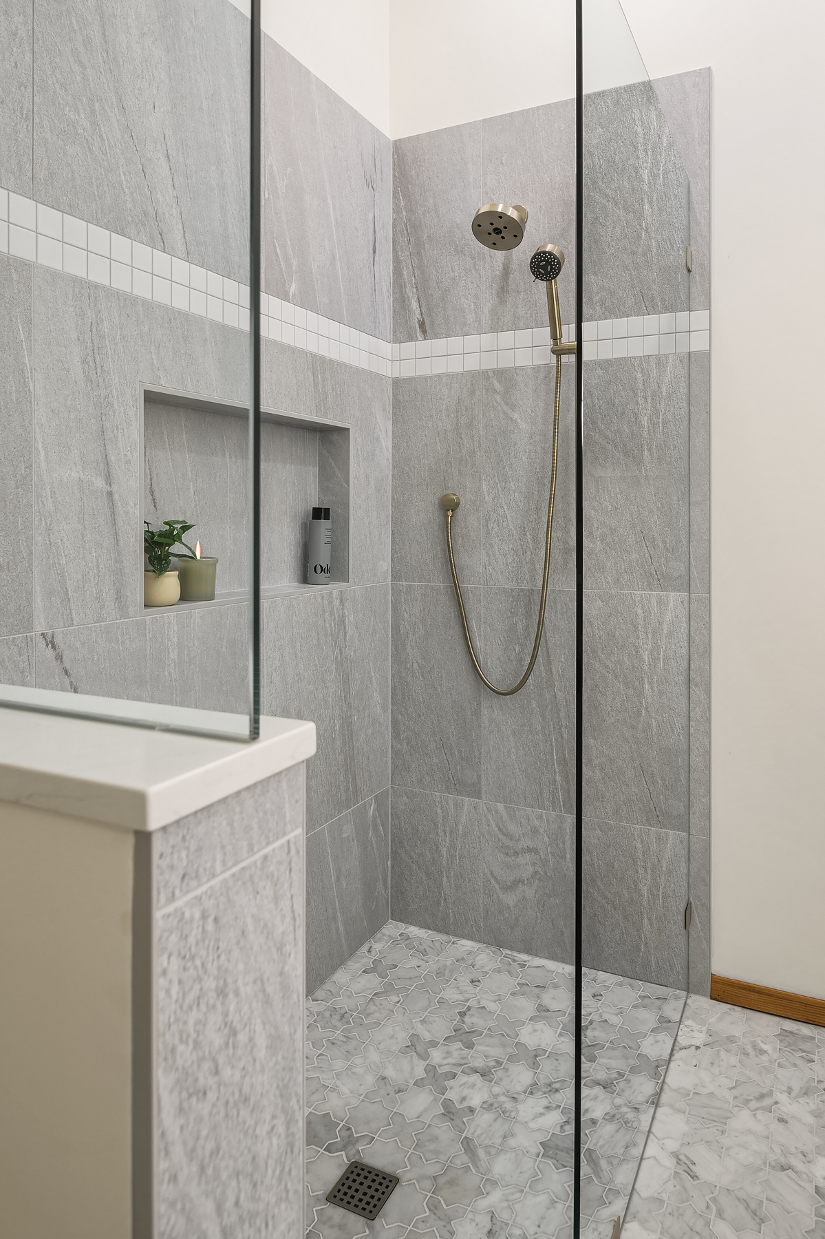
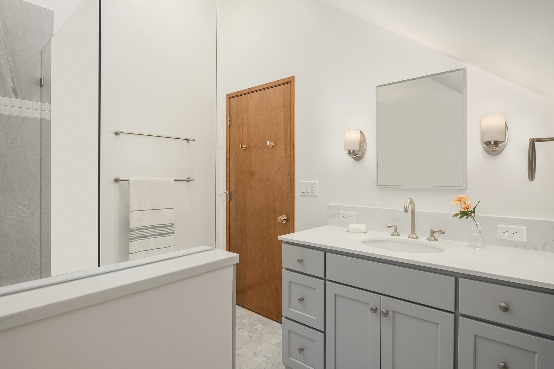
We seamlessly integrated nature-inspired design into the primary bathroom, using iron blue stone tiles to encase the spacious 48” x 72” dream shower. Positioning the shower beneath the highest ceiling point enhances the feeling of spaciousness within the glass walls, creating an uplifting atmosphere.
The use of bright, neutral colors effectively illuminates the windowless room, transforming it from its previous cramped and dark state into a luxurious space. Placing the shower controls on the pony wall ensures clients can adjust the water temperature without being subjected to sudden cold plunges or scalding hot water.
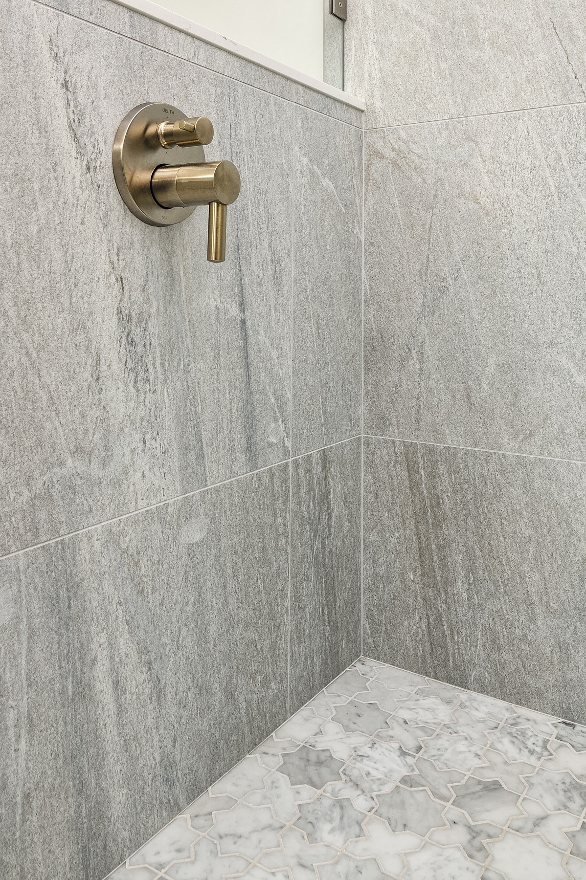
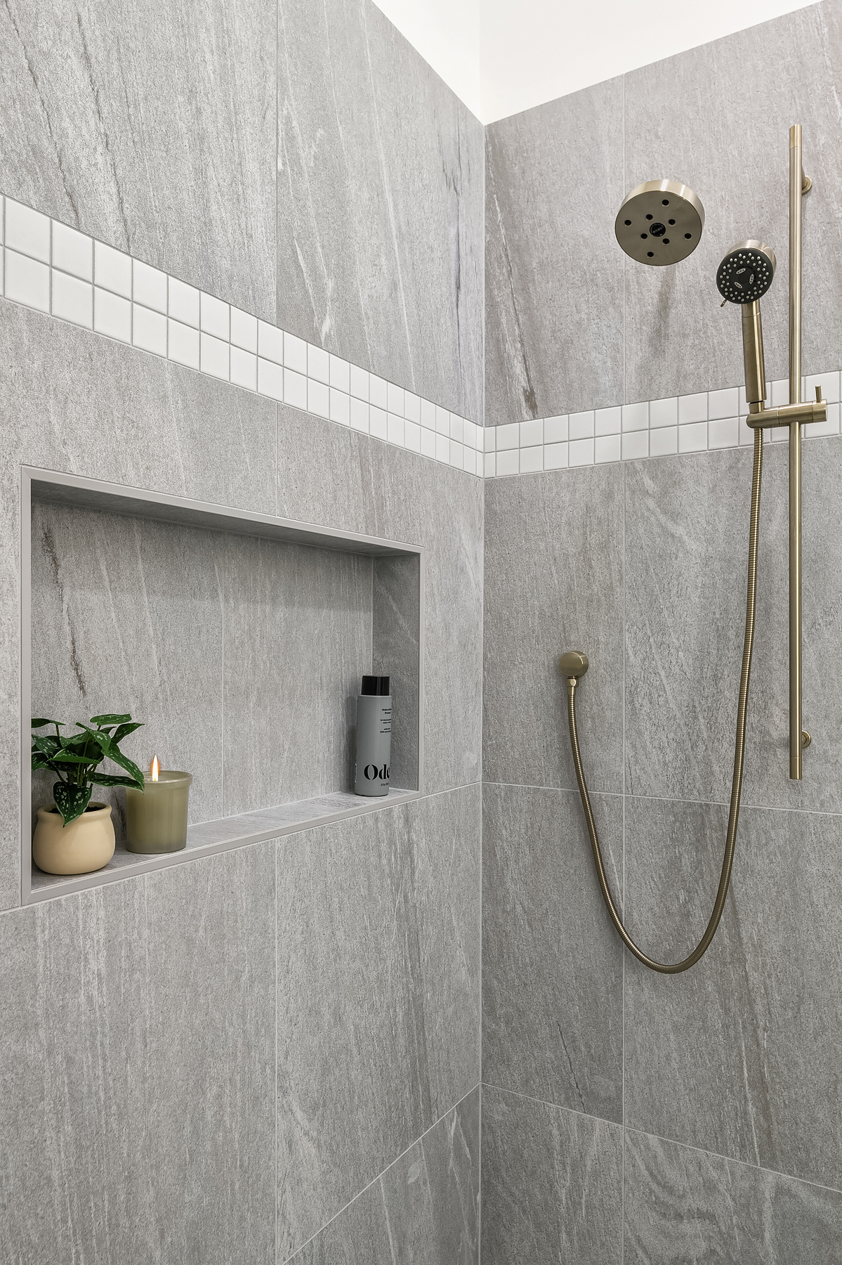
The vanity anchors the space, featuring an off-gray color that harmonizes with the white Carrara marble floors. A standout feature is the cross-stitch pattern that seamlessly extends into the curbless walk-in shower, enhancing the overall cohesion of the design.
As remodelers, nothing makes us happier than seeing how our work enhances our clients' lives, and that's exactly what you can see in this home's design. Now, this couple can enjoy their empty nest years in a vibrant and captivating kitchen. Laundry day is no longer a game of hip-checking the vanity sink, and they can truly relax in a primary bathroom that oozes cleanliness and beauty after a long day.

