How to Choose the Perfect Color Palette for Your Seattle Home
We may be able to color-coordinate our clothes and match a decent pair of sheets to our bedroom throw pillows, but choosing the right paint for the inside of your home requires a whole different layer of insight. Typically, you want your home to blend in with its natural environment, but that doesn’t mean you have to settle for overused and underwhelming colors. It also doesn’t mean you can’t step outside of the box! However, homes historically have fit into certain color categories that act as a guide for what our spaces should look like.
Seattle homes in the Pacific Northwest for example generally follow what we call, the “Fisherman’s Color Palette,” or the Cape Cod color palette, which capitalizes on the use of blue, gray, and white. Unfortunately, these cool, muted colors are often overwritten as being monochromatic. As a result, homeowners in the same region will also gravitate towards bold, warmer colors like red, gold, and tan in rebellion against the constant rain and overcast. In this regard, PNW homes are complementary to both bold and subdued tones. The question still remains: How do you avoid choosing from the charmless and uninteresting colors in this lot?
Begin the Journey to Color Re-Discovery
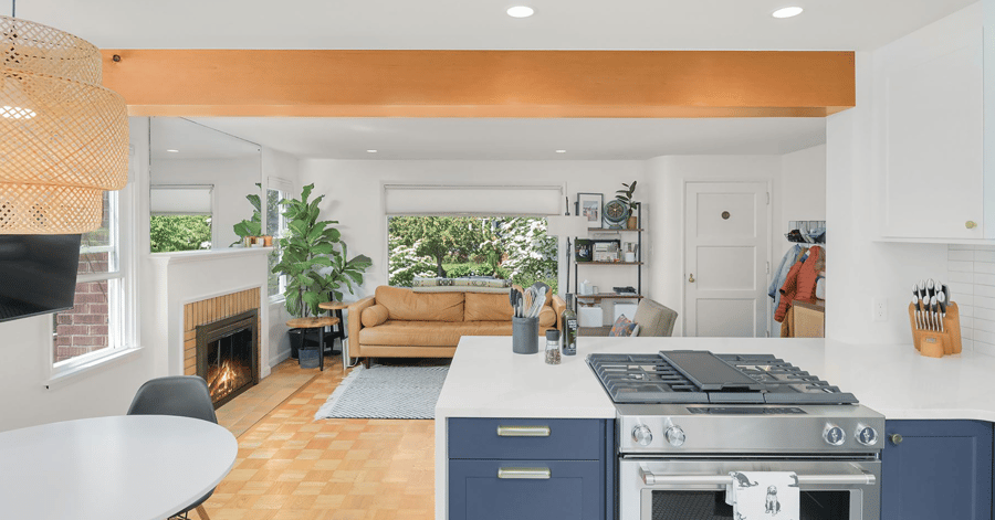
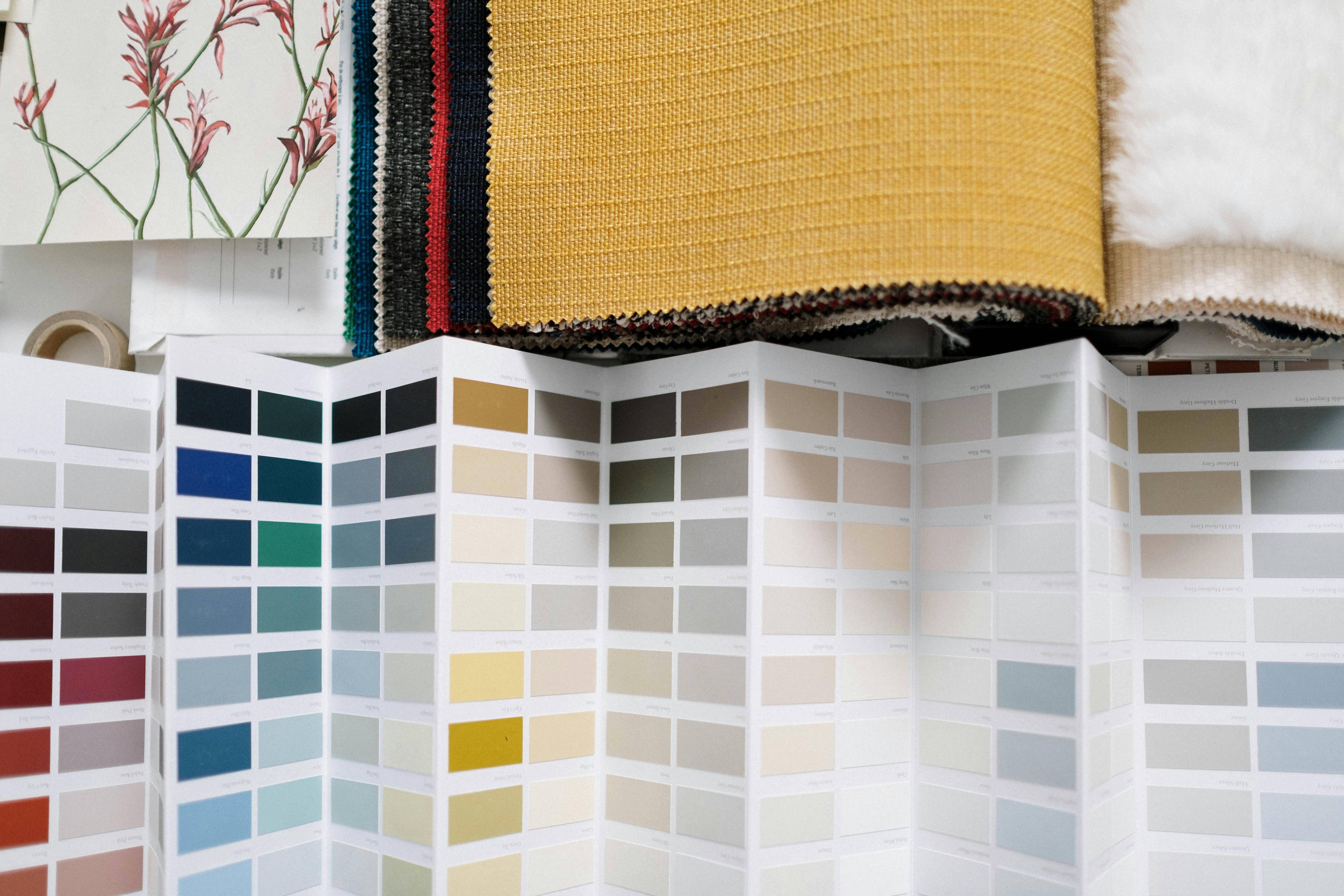
To spark your creativity and stay up to date on trending colors that will pop in your Seattle home, we recommend using the 2022 Sherwin Williams Color Forecast. Let’s dive deeper into the captivating side of these popular, widely-seen colors as we share our top favorites from this year's forecast, plus others that caught our attention!
White
 Bright and airy, white paint colors lighten the space and help carry natural light throughout the home. Offering security and feelings of wellness, this color also allows more exploratory pops of color in decor and furniture to stand out against a neutral backdrop. Cooler whites counteract the yellowness brought on by natural light, whilst warmer temperatures balance out dimly lit rooms that require an extra layer of comfort.
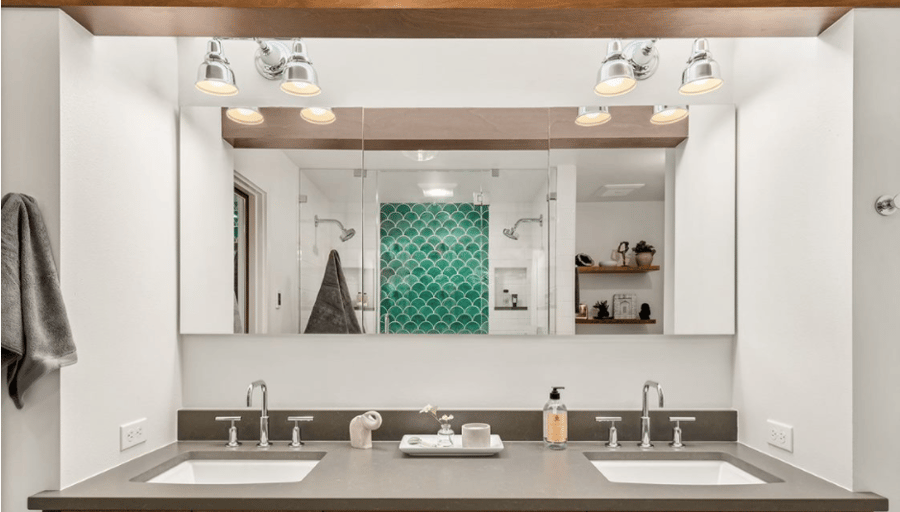
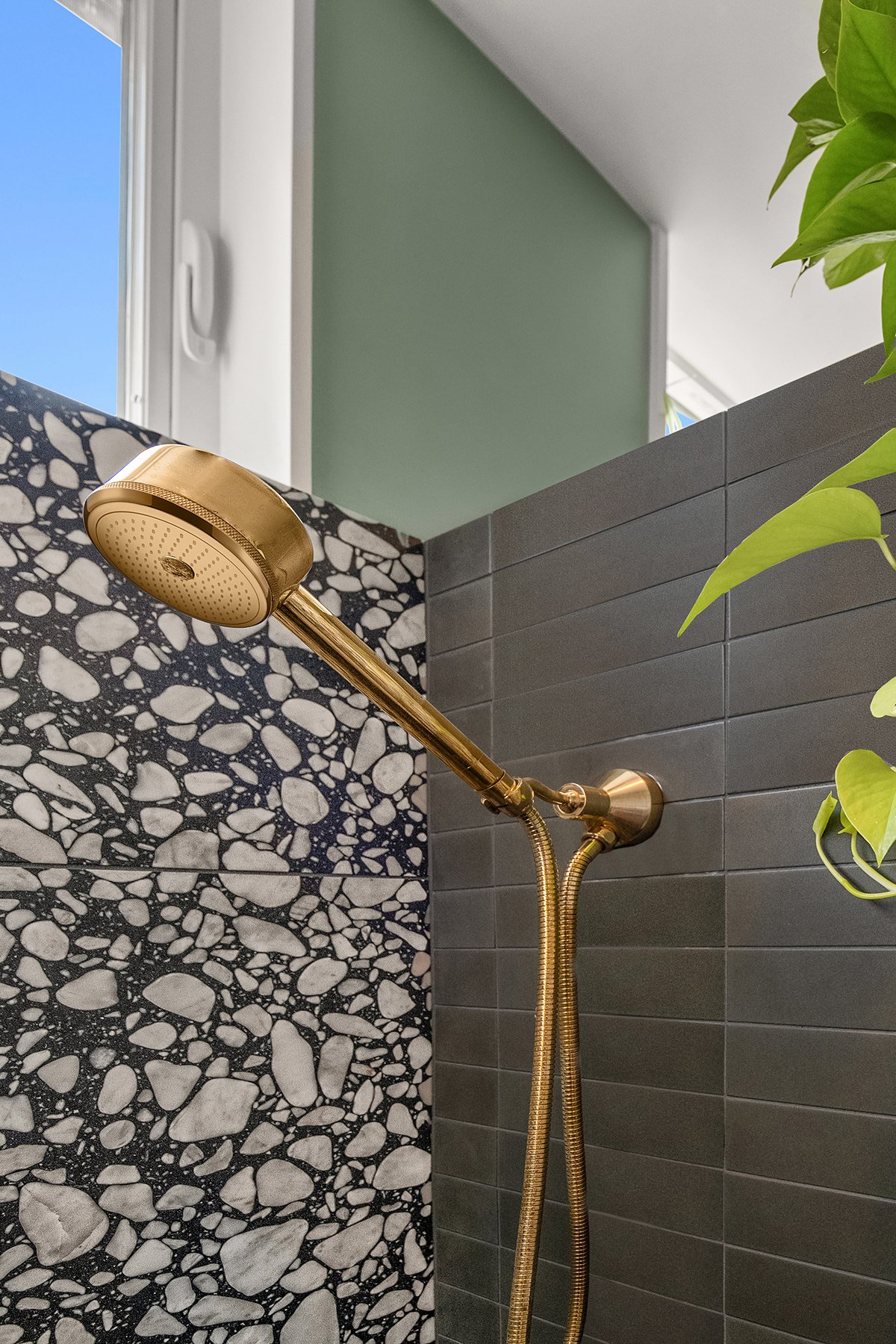
Alabaster is the most frequently used “white” paint color for IHR remodels, and for good reason! This softer, more subdued shade offers a striking contrast against bolder colors while being easier on the eyes than most other whites. It is not as bright and not as piercing, relying on neutral undertones that help it pair perfectly with other cool colors, such as light blues or grays. Alabaster is a chic choice for any room in the home, especially for those who want to communicate a sense of healing and rest. Interestingly enough, this shade was the 2016 Sherwin Williams Color of the Year, and it proves itself in every project why it is still deserving of that crown. Check out IHR’s latest project below where we used Alabaster to create the perfect, clean environment for our client’s new Primary Bathroom!
Gray
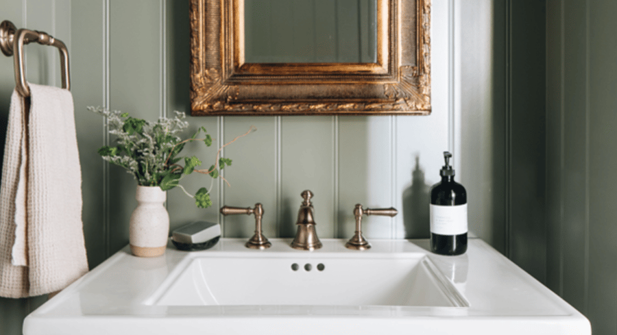
Seattle residents are no stranger to the rocky shorelines, abundance of marine life, and gray clouds that trail the Pacific Northwest coast. Choosing gray paint is a simple way to reflect this color in the home, and today it is easier than ever to experiment with the dull undertones of gray by animating it with hints of blue, brown, green, and sometimes even lavender (see our last recommendation).
Blue
Blue generally evokes feelings of serenity and tranquility, a nod to the stillness of our lakes and the beauty of our oceans. Different intensities of this color will convey different moods, some illustrating movement and boldness, and others that rely on the calming nature of tinted silver or taupe undertones.
Red
 Let’s be honest, painting a room red can be a bit of a power move. If you aren’t afraid of indulging in intense and bold styles, red paint can inject the ideal amount of vibrancy and energy into any space. Certain tones are more contemporary and have earthy undertones, whilst others are chic and give off a more glamorous feel.
Tan
 The chameleon of all neutrals, beige and tan paint colors will always serve as a wonderful backdrop to deeper shades and yet stand alone to create a space that is both soft and pleasing. Tan is dry, but it is also breathable, reminding us of a more deserted landscape cascaded in rustling dirt and earth tones. Darker shades tend to look brown, whilst lighter tinted versions appear pastel, which is perfect if you are browsing for something less intense.
Something New: Sherwin Williams 2022 Color of the Year
One popular color that has not been discussed yet is the color Green. This year, Sherwin Williams shouts out the shade Evergreen Fog SW 9130 as being the most “...versatile and calming hue” in their entire library, describing it as “a chameleon color of gorgeous green-meets-gray, with just a bit of blue.” A simple yet sophisticated shade, Evergreen Fog is a gorgeous, organic color that breathes freshness into every space.
Why is this color perfect for Seattle residents? Besides the fact that it is soothing and calming, the best thing Evergreen Fog does is offer a variety of the same color we see outside our windows every day. It is a softer, more subtle green from the pine and elders we see in our neighborhood and backyards, making it an excellent choice if you are trying to create a cozier environment for your home.
Finding Your Perfect Match
Choosing the perfect color palette for your home doesn’t have to be an uphill battle or end in frustration. At IHR, we believe this journey is as important as the remodel itself, given that paint is the one-step surefire way to change the mood or tone of any room. For further help on deciding what palette to choose for your kitchen and bathroom remodeling project, reach out to the professionals at Innovative Home Renovations today and uncover a color scene that makes you fall in love with your home!



by Megan Stoke