How to Choose Colors for Your Bathroom Remodel & Avoid Palette Paralysis
Bathrooms are a key location in your daily routine – both in the morning and at night. As you scrub your teeth and prepare for the day ahead, you want to be invigorated by the space you’re in. When you’re washing off the day’s debris in the shower, your environment should enhance your ability to wind down and relax, not inhibit it.
Bathrooms can be tricky spaces to design because they typically have limited square footage and can be exposed to varying levels of light throughout the day. You must consider these different lighting scenarios when designing your bathroom so you can love the space when it’s bathed in the mid-morning sun and in dim moonlight, since you’ll inevitably end up using the room at all hours of the day.
If you’ve taken on the challenge to remodel this essential space, improving not only the functionality, but the energy the space emits is crucial. How can you control the feeling a bathroom elicits? Via its interior design elements – especially through color.
Why is my bathroom’s color palette important?
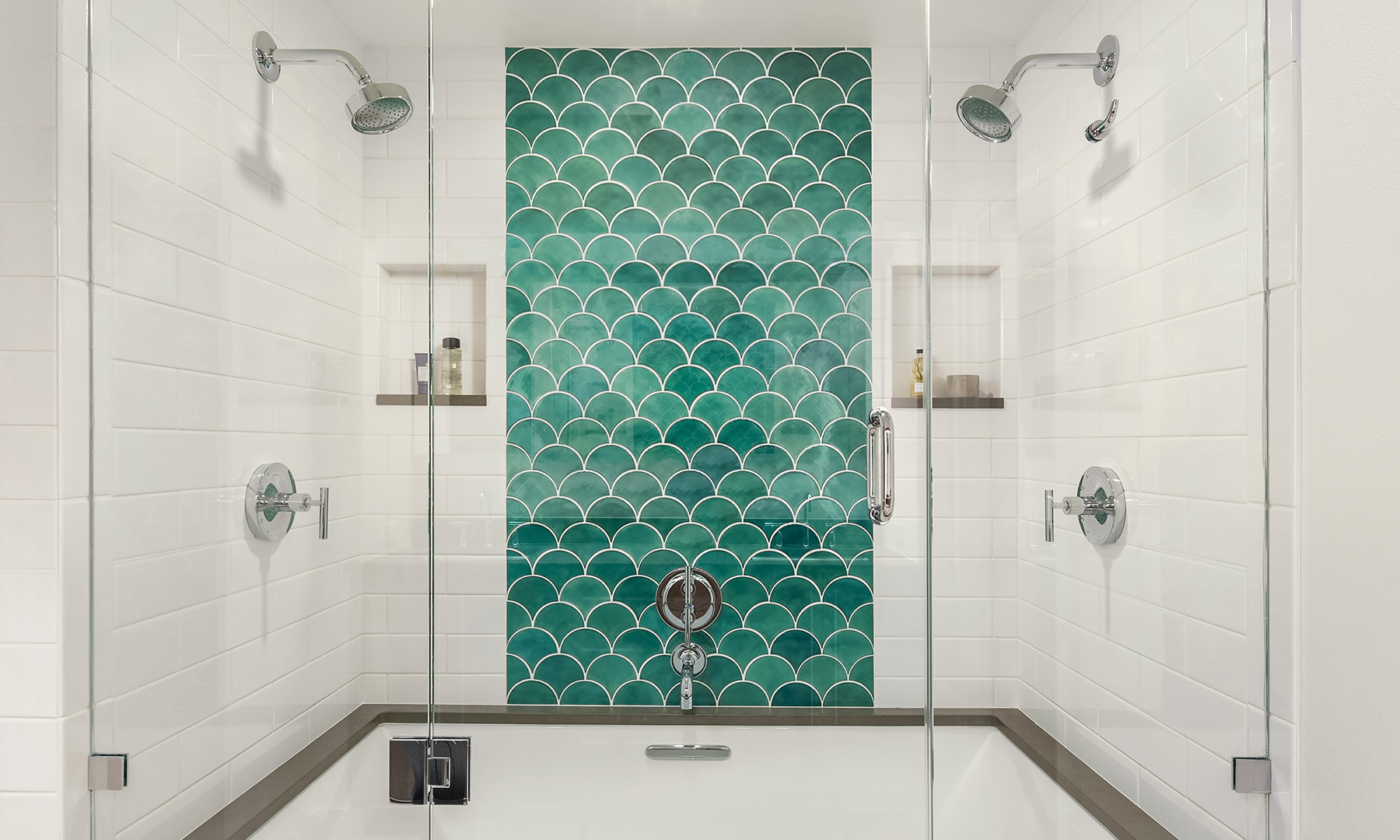
Both color psychology and color theory play important roles in interior design.
Color psychology is concerned with how different hues, shades, and tones affect our brains. Regarding interior design, color psychology pays attention to how a room’s individual colors influence the mood of the space. Its personality, and how it makes someone feel when they’re in it.
Here are a few popular examples:
Blue – Often associated with water, blue creates a sense of calm, tranquility, and reflection.
Pink – This color reminds people of love, tenderness, and youth. It’s strongly linked to femininity, and often gives off qualities of sweetness and innocence.
Yellow – Tied to the sun, yellow brings out energy, optimism, and joy. It grabs your attention and stimulates mental activity – but in interior design, we must be careful not to overuse it!
Red – As a strong, bold color, red conjures the strongest of human emotions: power, passion, power and danger.
Color theory considers how combinations of colors look and make us feel. We can use it as a guide to tell us what will look good together in a room, and someone’s experience of that room will be affected.
To apply the principles of color theory to a palette, often the color wheel is used (yes, the same concept you probably learned about in high school art class!)
There are a few common groupings people make using the color wheel to determine their color scheme:
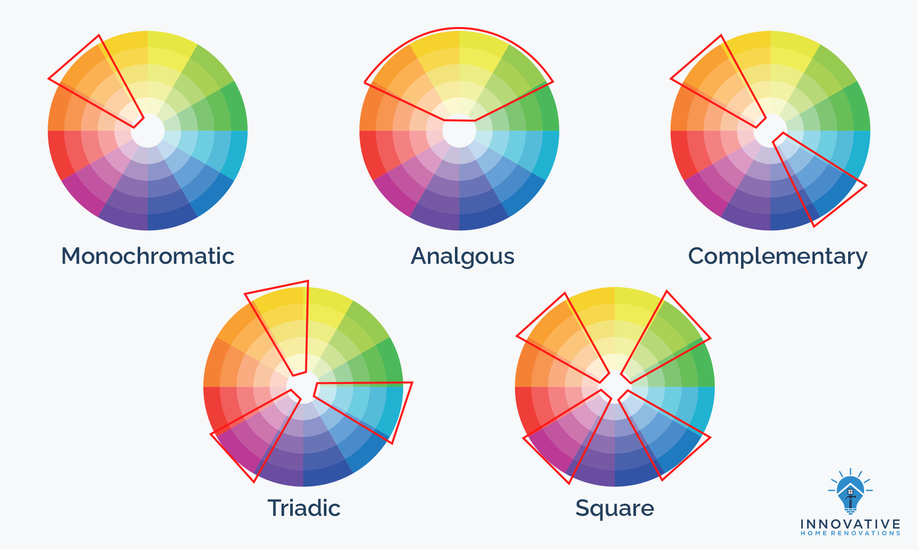
Analogous: Groups of colors that are directly next to each other on the wheel. This palette in a room is easy on the eyes.
Monochromatic: Different hues, varying in its lightness or darkness. Monochromatic color schemes create a polished look.
Complementary: A pair of colors that are opposite each other on the color wheel – blue and orange; red and green; purple and yellow. The contrast created with this palette makes a room pop.
Triadic: A trio of colors that are equally spaced out on the color wheel. This grouping looks dynamic in a room, while still being harmonious.
Square: A group of four colors that are equally spaced out on the wheel. This palette allows for a lot of variety in a room; it’s best used by choosing one dominant color use the others as accents.
See also: 5 Costly Mistakes to Avoid During Your Seattle Bathroom Remodel
How to select your bathroom remodel’s color palette
Now that we understand that colors have meaning and there are many ways to combine them, here are some tips to help you start building your bathroom’s palette.
Create a palette to match the mood you want
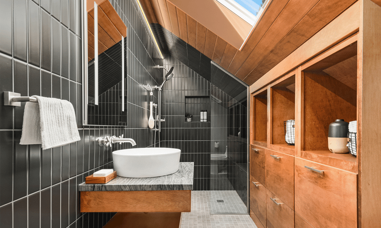
Since color has such a strong influence on how we feel in a room, you need to decide what mood you’re going for in your bathroom.
Do you want to create a bright, energetic atmosphere in your bathroom to help jump-start your mornings? Bright colors, high contrast, palettes with yellows, red, and oranges will help get you there.
Or are you going for a moody, sophisticated tone so you can be reflective as you’re going about your business? Opting for a palette with darker shades and jewel tones can create that vibe.
Start with the intended mood in your bathroom and use your newfound powers of color psychology and color theory to help bring that intention to life.
Draw inspiration from the rest of your home
Sometimes what you need to get started is right in front of you: look around your home and see if there are any colors you’d like to carry over into your bathroom. There may be hues that tend to repeat themselves, and including those would help build continuity.
Or you might find a one-off accent color that sparks joy – it’s worth following that instinct and experimenting with it in your palette creation, you may be surprised at what tones end up working quite well!
Look at what’s trending in styles you like
If you’re shooting for a particular design style, you can research what colors are commonly used within that style. To do that, however, you need to be able to describe your design style in the first place!
If you don’t have an interior design style picked out for your bathroom yet, you can take our design style quiz or browse interior design glossaries, such as this one from HGTV.
Websites like Houzz and Pinterest are fantastic for finding inspirational imagery for your project. Take a look at the Houzz idea boards we put together for Traditional, Transitional, Contemporary, Minimalist, and Farmhouse bathroom styles.
Going for a southwestern look? It makes sense for your palette to consist of warm earth tones, potentially with a teal accent. Are you planning for a transitional style? A palette of neutral and cool toned colors, with one or two surprising accent colors would suit you.
See also: 7 Design Elements to Include in Your Master Bathroom
Pick one color and build from there
If you’re overwhelmed with the concept of choosing an entire palette, start with a baby step: settle on one color you’d like to include.
Once you have that color selected, whether it’s a base color or just an accent, it will be easier to find shades to complement and contrast it – and you’ll have a completed palette before you know it.
Don’t neglect the neutrals
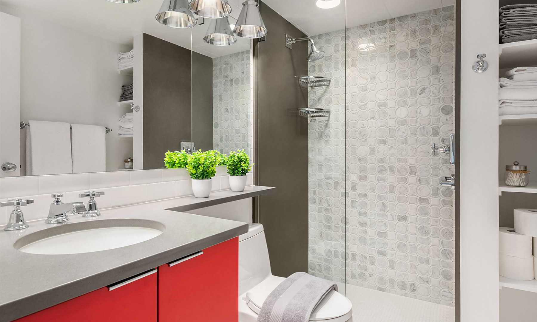
As much fun, energy, and interest as colors can bring into a room – a well-balanced bathroom will typically have some neutral colors mixed in to tone down the drama. There are plenty of shades of white, gray, beige, brown and black to choose from, and they can be just what your bright selections need.
Take into account the size and lighting in the room
There are certain physical features of the room you should consider when choosing your color palette.
If your bathroom is small, the right amount of contrast can add whimsy and fun – but too much can make the room feel constricting. If your bathroom is on the larger side, cloaking in in neutrals could make the space feel barren and uninviting; fun accents can make it inviting and cohesive.
Not a lot of natural light? Too many dark shades can make the room feel like a cave.
Use your color palette to play up the strengths of the room and account for any drawbacks that can’t be solved in the remodel.
Pro Tip
When you work with a design-build firm, you’ll have an interior designer and contractor working together to solve for space and light limitations, so you don’t have to compromise your design aspirations.
How do I use a color palette in my bathroom remodel?
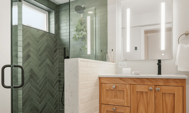
Once your color palette is selected, how you apply it in your bathroom is entirely up to you and your artistic vision. If you’re wondering how a few different shades on paper can translate onto your walls, counters and fixtures, here are some general rules of thumb.
Follow the 60-30-10 rule (or 70-20-10)
Not sure which colors to place where? This rule helps you create disperse your selections in a cohesive way: 60% of the room should follow your “base” color – typically a light or neutral shade, it’s the foundation of the room. 30% should be in your secondary color, a hue that contrasts the primary color and adds interest for the eye (for an accent wall, some tiling, or vanity color, perhaps?), and 10% is allocated toward your accent color. The accent color works best as a complement to your secondary color. Here’s your chance to incorporate a bright shade, or a metallic tone.
See also: Finding the Perfect Tile: How to Satisfy the Needs of Your New Bathroom
Use your colors 3 times each
Each color should be used multiple times throughout the room, so that no color looks exceptionally jarring or out of place (unless that’s your artistic decision). Repetition fosters cohesion, and cohesion will make your eyes happy every time you roll out of bed and into your bathroom.
Pro Tip
Planning to use more (or less) than 3 colors in your bathroom? No problem – the main takeaway here is to have a base color, and weave other colors in to add depth and interest to the room, without making the space feel overwhelming or disjointed.
Call in the color experts
Choosing a color palette that fits your design style and your bathroom can be trickier than it seems; with an entire spectrum to choose from, there’s no wonder it can be difficult to pluck out 3, 4, or 5.
Interior designers aren’t magicians, but they’re close. Working with a design-build firm like Innovative Home Renovations will give you access to the creativity and expertise of an in-house interior designer, who will work with you to turn your vision and style into a complete transformation of your space, up until the last towel is hung.
If you want to talk through the design possibilities of your Seattle bathroom with a dedicated team, contact us to get started.



by Haley Carroll